Wednesday, June 14, 2017

El Camino SoCal

And Not Wordless Either

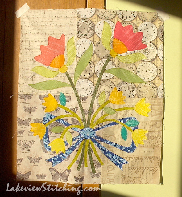
I thought I was ready for my summer break, but, it turns out that I'm not. Last week I shared the start of this project, an adaptation of Nancy Rink's quilt In Remembrance, from her book El Camino Real.


I had a long list of challenges with this quilt, from how to make it to what to call it. "El Camino SoCal" is the best name I could come up with, a) to reference the book, and b) to capture the bright, flat, almost neon colours of the applique.

There has been a lot of private, offline hand wringing about how to approach this quilt. The first plan was to needleturn all the applique. But, it turned out that the Laura Gunn Painters' Canvas fabrics are pretty heavy for hand applique. So, I thought if I enlarged the pattern it would be easier to turn smooth curves. But, then I waffled about whether the quilt was for use, or for art. For art, it would be too big, and for use, it was going to be a lot of hand stitching for something that would have a reduced lifespan in the washing machine.


When I realized this year that I had to learn to fuse, this project suddenly transformed into something both feasible and practical. And I have to admit, fusible applique is probably a much better fit for me anyway. My favourite part of the process is the start -- designing or revising someone else's design, choosing the colours and fabrics and seeing how they work. A long slog once all the decisions are made is not something I enjoy.

So, as you see, two more blocks are already redesigned and fused. And, the first two are now stitched. I'm using the same straight stitch edging as my Aunt Millie project. This time I'm using 28 wt Aurifil cotton in dark red:


I had hoped that the heavier thread would make a heavier line, but honestly, I think I would get the same effect with 40 wt thread, and a more balanced stitch too.

I am quite happy, though, with the "exposed seams" look of the topstitching. You will laugh, but it reminds me of all the Issey Miyake designs that I used to love in the 1980s. Between the stitching and the neon colours, the 80s are strong in this quilt!


It is only for a few weeks a year that we get the setting sun shining up on the wall like this, so I am glad to take advantage of the light! It's nice when everything works out. :D

Thursday, June 1, 2017

Butterflies and Break

Butterflies, Bees
and Blogging Break

I have several photos today. It's time again for the Kaleidoscope of Butterflies link up, in support of awareness of butterfly and bee habitats. Earlier this month we made a visit to Hy-Hope Farm north of Pickering to stock up on butter tarts and take some photos. It is always photogenic there! Later in the summer they will have more local produce, but this time they had a great display of flower baskets.


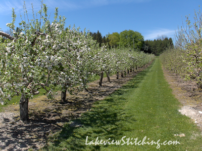
They also have a working apple orchard:


So, that is plenty of work for the bees. The trees were just coming into bloom. Look at this one:


Isn't that cool? I've never really noticed that growth pattern before.

It is several years now since the City of Toronto, and a year later the rest of Ontario, banned chemical herbicides and pesticides. Now every spring the city is a sea of dandelions! But apparently, dandelions are good for bees:


So, in a few more years it may well be uncool to mow the lawn!

In quilting news, I managed to sew up another six Moth in the Window blocks, from the pattern in Addicted to Scraps by Bonnie Hunter:


That one on the top right there is very disappointing, given that both fabrics are very nice. But, I'm not going to redo it! This past week I think I have finally learned my lesson about contrast, as you will see in a bit.

The first time I shared this project in April, there was some discussion about whether my lucky white butterfly was a butterfly or a moth. I looked it up, and the answer is butterfly! But, it can still be a pest. :D  And the difference between butterflies and moths is interesting too.

For the past two years I've taken a 2+ month blogging break over the summer. This year I want to try some new things before it gets too hot, so I think I'll break earlier. I find it is easier to experiment with new techniques when I'm not worried about analyzing everything for my blog.

Yesterday I got this new book by Katie Pasquini Masopust, Artful Log Cabin Quilts, and this is going to be my first big distraction. The combination of improv-pieced log cabins and abstract art quilts is very appealing. I started a new project right away!


As you see, I did not make a strong start. There is not nearly enough contrast in here to make it worthwhile. I am amazed at how many fabrics I have in the exact same value of olive green!

But, the one smart thing I did was start with the corners of my project. So, I will keep them and improve the middle.

The book has a lot of information about what makes a good photo, particularly regarding the range of contrast. Sadly, I did not pay close attention. This was my starting photo:


These are the waterlilies that grow along the Spruce Bog Boardwalk in Algonquin Park. It seemed like a good plan, but now I realize there are too many flat areas of colour for this technique. Anyway, I think I can save it. And, I have quite a few more ideas after that...

So, I'm not going to post regularly this summer, but I may pop in once or twice. I have at least three projects that are very nearly done, including Picnic...


...which is quilted and just needs binding now. I'm sure I'll post them right away if they get finished!

In the meantime, check out all the other butterfly and bee photos, fabrics, projects and info at the Kaleidoscope of Butterflies link up, right here. Happy stitching!

Related Posts Plugin for WordPress, Blogger...