Saturday, January 7, 2012

Choosing Colours for Sedona Star


You may be wondering, when I keep talking about how inspired I was by my hand-coloured copy of the blank Sedona Star pdf that took me two days to do, why I have not posted this work of art yet!  I admit that I am hoping to create a bit of mystery about my design.  But I will talk about how I chose the colours.

I had two main principles in mind when I started.  The first, from various art classes over the years, was to put high contrast around the features that you want to stand out.  The second, and more important one, from interior designer Ray Staples, who always tells it like it is, that not every piece in the room (or in this case, quilt) can be the star.  She compares it to a Broadway show, with one or two stars, one or two supporting actors, and the chorus.

I was very struck by this when I heard it, because until then my philosophy had always been "more is more" -- more fabrics, more patterns, more colours.  I realized that too much noise can reduce the clarity of the message, and I wanted my Sedona Star to have a strong message.

I sat down with the uncoloured page and asked myself what the story was here.  What elements do I want to make stand out?  For me, it was the heart appliques first, and the nine Mariner's Compass blocks second.  So, the heart appliques will all be the same fabric, and that will be the only place I use that fabric.  To tie them all together so they tell a consistent story, my plan now is to do the Mariner's Compass blocks with just a few fabrics in a high contrast palette.  I say "my plan now," because this the area where I have the most doubt at the moment.  Will it be too boring?  The only way to know for sure will be to stick to my guns until the end.  I'll try to be strong!

Everything else followed on from that start.  I noticed the repetition of "nines" throughout the quilt.  I know nine is a significant number in many mystical traditions, so I'm hoping designer Sarah Vedeler will share more background on her inspiration.  I usually think of the nine planets in the solar system (if you still count Pluto). If you are a science nerd (which I kind of am), you know that the number nine has many interesting properties. Are there nine energy vortices around Sedona? 


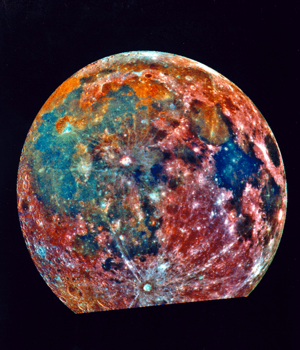
This colour-enhanced image of the moon is not my palette, but it is kind of pretty, isn't it?  Anyway, most of the features on my quilt will be done with solid colours, a combination of Kaffe Fassett Shot Cottons and Kaufman Kona Solids.  The parts that I want to blend together will be prints.

I can't wait to show you my fabrics and get started!  If only they would get here!

Friday, January 6, 2012

Washing Fabric

I am still waiting for my fabric for Sedona Star to arrive, which is just as well, because I still have lots of organizing to do.  I think I mentioned earlier that I recently committed to washing all my fabric before I use it.  Even though I once saw cheap unwashed fabric shrink under the iron right before my eyes, I couldn't get over the hurdle to start washing it.  Now the hurdle is very high, because my stash is over 20 years old, but I am slogging through it a few loads at a time!


In the back is the washed and waiting to be sorted by colour pile, and the bins in front are waiting to be washed.  You can see I am getting down to the older fabric now!

It was Becky Goldsmith who changed my mind about washing fabric, at a workshop she did last spring for my second guild, York Heritage.  I learned a lot at that workshop!  Becky recommends that you put your fabrics in the washer AND DRYER, which is something I hadn't done before.  I thought the dryer would tangle it even more than the washer did, but I was thrilled to find out that it doesn't tangle at all.  Because she mainly teaches applique, her argument is that even cotton fabric will felt a little in the dryer, so it frays less and is easier to applique.  I also really like the feel of the fluffier fabric.

How many of you have had a good look at your stash recently?  I've been opening boxes I haven't opened in years!  There have been many pleasant surprises, and also a few "what was I thinking" moments.  Sky blue is not really my favourite colour any more!  I also found a whole series of pinks and reds, and I had no idea what they were for.  Then yesterday I remembered my plan to make heart-shaped log cabins.  I still like that idea enough that I have added it to my to do list!  So it's kind of a dangerous process as well!  Especially given that I had to buy new background fabric last night...

Wednesday, January 4, 2012

Quiltmania No. 85


Although it is published in France, Quiltmania has been written in English for several years now, and the instructions are in both metric and imperial.  It is reliably one of my favourite magazines.  Quiltmania publishes two separate series - the numbered series is in English and comes out six times a year.  This series has articles as well as some projects.  They also produce a quarterly series, the "Special Editions," which are just projects and written in French, with metric measurements.

The one I bought this weekend was No. 85, September/October 2011.  Because they are imported the news stands in Canada are generally behind with this magazine.  You can also buy back issues (and many tempting but expensive books) at the Quiltmania website

Quiltmania goes to all the international quilt shows and prints good photos of the highlights.  This issue has quilts from Europe, Australia and Japan.  The focus is mainly on traditional quilts this time, with some really stunning efforts in both Australia and Europe.  Here are some more ideas for your half square triangles!

While it is not the most impressive quilt in the magazine, I was also struck by this one:


I thought this was a great way to set a sampler quilt.  The blocks are well unified, and it has good graphic punch.  I rarely like sampler quilts, most of them look too random and unbalanced to me, even with a limited palette.  So this is a great setting to keep in mind!  I noticed one of the shop ads in the back of the magazine has already used this idea for one of their kits.

There are a few photos from an exhibit of Reiko Kato and her students' latest quilts.  I just love the Japanese taupe quilts, and all the little accessories they make.  The fabrics are completely different than North American fabrics though, so for now I am just buying books rather than fabric.  I am SO tempted by Kato's latest - Garden Party.  If only I didn't have to import it from France!

Quiltmania is another great magazine for fairly simple quilt patterns with good design value.  Even though there are a number of American designers featured, the designs are a little different than those you find in American magazines.  There is a really gorgeous design, Eldon, from Edyta Sitar, with log cabin stars that you must see if you like her work.  I'm not sure if it was previously published, sometimes Quiltmania projects have been.  This one is not for beginners, though, the piecing has to be very accurate.

The cover project is called Ryokan, after the Japanese guest houses, although the designer Joe Wood is also American.  I think it is another great way to incorporate sampler blocks in an overall design!  The instructions for this project will be continued in the next magazine, No. 86.  It makes me think of all the barns in Pennsylvania with quilts painted on the sides - I'm sure there is a good quilt idea in there somewhere too!

Both this magazine and the one I reviewed yesterday, Sew Scrappy, had quilts featuring churn dash blocks, which was kind of interesting.  I guess it is a nice, simple block.

Finally, there is a very impressive design, Fontainebleau Forest, for an English paper pieced quilt that combines diamonds and hexagons in a pinwheel motif.  I already have an English paper pieced project in the wings, but I will keep this one in the back of my mind.  It is all fall-coloured batiks in greens, oranges and browns, and just gorgeous!
Related Posts Plugin for WordPress, Blogger...