Friday, November 7, 2014

Ink Week, Part 2


In Part 1 of Ink Week, I inadvertently created a splotchy pattern with the Cerulean Blue Tsukineko ink in the border of two of my birdhouse blocks for Leanne Beasley's Down in the Garden stitchery quilt. In the end, I liked those ones the best, so I thought I would do the same technique to fill in the watering cans in four of the other blocks.

However, I learned that the Cool Gray ink behaves rather differently! The blue ink really moves out the edges of the brushstroke, while the grey seems to even itself out. In the photo above, the splotches have almost vanished.

I also learned that the ink tends to settle to the bottom of the cup over time. This was actually helpful, because you end up with more pigment at the tip of the brush, which then pushes out the edge of the brushstroke. So the last piece I did came out splotchier, as you can see in the photo I took while it was still wet:


But, once it dried, the edges of the strokes still blended out:


Which is fine! It still has that watercolour feel to it. You will also notice that for these blocks I decided that it would be better to have a thin white edge along the line, than to let the ink go over. It will be interesting to see how it looks once the lines are stitched!

Until this point all the inks were used straight out of the bottle. The colours for the leaves and flowers, though, are all mixed from two or more inks.

Here's my Day 2 test sheet:


After finishing all the grey parts, I started to mix the colours:

  1. I began with drops of the pure, undiluted ink. This is the orange,
  2. And this is the pure yellow,
  3. And this is the Banana Cream that I used for the birdhouses.
  4. The pure yellow is very harsh and a little greenish, and my goal was a softer, yellow orange. I started by mixing the pure yellow with a couple drops of pure orange. Nice colour!
  5. But, when diluted, the orange almost vanished and it went back to bright yellow. You can see I tried various levels of orange and water to fine tune the mix.
  6. I thought I had the colour right here, but it still turned out to be too saturated, and not as transparent as I wanted.
  7. This is the final mix that I used on all the blocks. In the photo below you can see that the ink looked a lot oranger in the mixing cup than it did on the fabric.
  8. Next up were the greens. Now that I knew how much the colour changed with the addition of water, I looked at that first. This one is the pure lime green ink on the right, and the diluted lime green on the left. You can also see that the lime ink in the bottle is really a mix of pigments, and that the blue pigments once again moved closer to the edges of the drops, leaving the yellow in the centre.
  9. The emerald green ink was really surprising! On the left is the pure ink, and on the right is the diluted ink, which turned almost turquoise!
  10. In the end I used three different greens for the quilt. This one is a diluted combination of the lime and emerald. It still felt a little artificial to me,
  11. So I added a couple drops of the orange to brown it down. This is the mix I used for all the leaves.
There are also diluted lime, and a lemon-lime mix in some of the flower centres. Here's that yellow orange from #7:


I still have the centres of the yellow flowers, and the three other flowers to do, which will amount to four separate sessions with a dry in between each one. I'd like to do it in one day, but it may end up being two more. I'm past the "white knuckle" stage though, and it's starting to be fun! You can already see the blocks coming to life:


Tuesday, November 4, 2014

Ink Week, Part 1


I have not been able to find any online information about how to use Tsukineko inks in a painterly way, so I thought I'd go in depth on my learning experiences with them this week. You can learn from my mistakes as well as my successes!

I'm making Leanne Beasley's stitchery quilt, Down the the Garden. A year ago I chose Tamara Kate's Flight Patterns fabric collection for this project. Inspired by the watercolour effects in the fabric, I thought it would be nice to "watercolour" the stitchery designs before I stitch them. Rather than use real watercolour paint, I chose Tsukineko inks for the job, which are water-based, but can be heat set to become permanent and washable.


I've had the ink for 10 months now, but it was never the "right time" to get started. Finally, to get over the first hurdle, I dredged up my science lab experience from a long time ago, and set it up like an experiment. I wrote down the things I wanted to learn:
  • Test ink colours - Banana Cream, Cool Gray, Cerulean Blue (not the colours in the photo above, those are for later)
  • Compare brushes with Tsukineko Fantastix
  • Try various wet/dry wash techniques
  • Test drying, heat setting
Then I made a test sheet with the same fabric, Kona PFD, and permanent lines, Pigma Micron, that I will use for the quilt:


I ironed a piece of freezer paper to the back of the fabric, to stabilize it while I worked. I picked up this tip from Linda M. Poole's book, Painted Applique, and it worked great!

Then I assembled all my equipment. Tsukineko Fantastix are blank foam pens that you can load with your ink:


I also bought a cheap set of brushes, and single-use eyedroppers to transfer the ink from the bottle to the mixing cups. I'm calling this "Ink Week," by the way, because my sewing machine is packed away until I finish this phase of the project.

Here's how my experiment progressed:

  1. I started with the undiluted blue ink, and a small brush. The Kona PFD fabric really sucks up the ink, and the more you hesitate, the wider the line.
  2. I wetted the corner of the fabric with water, and used the brush to paint a line of pure ink, then pull it back into the water. The wash took time to really soak back through the fabric.
  3. I decided the pure pigment was too dark for the effect I wanted to achieve, so I diluted the ink, and tried to repeat #2 along the edge of the first square. The diluted ink really soaks in fast! 
  4. I still felt the ink was too dark, so I diluted it more and loaded it onto one of the Tsukineko Fantastix. They are much easier to control!  I found that if I drew about 1/8" away from the line, the ink soaked up to the line but not usually past it. It is easiest to just dip the Fantastix in your ink, and hold the tip up for a few seconds to let it soak in.
  5. I used the same technique as #4 to colour around the birdhouse. The colour was flatter than I would have preferred, but I was ready to move on!
  6. Same as the blue, I started with the Cool Gray diluted and loaded onto a Fantastix for the flat area of colour in the first circle.
  7. For the second circle I soaked a little water into the centre first, and then filled in the edges with the same Fantastix as #6, and blended it back into the centre. Success! 
  8. I tried the same blended technique in the roof, with moderate success. At this point I got out the blow dryer and dried all the blue and grey bits before I started with the yellow. Waiting for the paint to dry is worst part of a watercolour technique!
  9. The yellow square was done the same way as #7, with a little water in the centre, diluted ink and a fresh Fantastix. There was no problem at all with the wet yellow ink picking up any of the dry blue ink.
  10. I went ahead and finished the birdhouse with the yellow.
Feeling pretty confident, and with the inks all set up, I decided to forge ahead and colour the four birdhouse blocks for the real quilt.


I started with the yellow this time, dried it, and painted the grey. The real grey roofs were narrower than my test one, so I gave up on the wash after two of them, and just filled them in with solid grey. The block above has been heat set with the iron, and I found that the yellow and grey both faded away more than I wanted.

The blue, however, was a little too dark! I wasn't totally happy with the flat blue colour around the birdhouse in the test piece, so I loaded the edges of the fabric with plain water, and tried to use the Fantastix to blend the ink back. However, I ran out of the first batch of diluted ink, and you can see I made the second batch too dark.

For the third and fourth houses, I was getting impatient, and I decided to use a wider brush to ink around the edges of the fabric:


You can really see how the ink carries out to the edges of the brushstroke! Then I used a Fantastix with the same mix to fill in the gaps along the line. I like these ones the best -- the blotches look a little like clouds to me.

All of them have some bleeding of the blue over the line. My hope is that with the stitchery added, it will not be too noticeable. I made a start with the embroidery on the worst one first, just to see if I can live with it:


It certainly has the "loose" feeling of some watercolours! I bought enough fabric to redo everything if the experiment failed, but at this point I want to keep moving forward. The others will be better, and once it is part of the whole quilt, I think it will just be a minor quibble.

Next up, the watering cans, and all the larger flowers around the quilt. I think it will be a couple more days!

Click here for Part 2!

Thursday, October 30, 2014

Jacks and Cats Progress


There's been progress on many fronts on my Jacks and Cats Halloween quilt. Last time I showed you all the felted wool cats glue basted and ready to sew. Now they are all sewn together and ready for the next step. Somehow the stitching makes them even cuter!

I've also prepped the pumpkins (Jacks). At the end I had an extra set of eyes! I guess the cyclops pumpkins threw off my count:


I remembered early on that the Roxanne Glue-Baste-It is not enough to hold everything together while I stitch, especially since I don't like to use too much. So you can see that I've added a few basting stitches as well. The pumpkin stems, vines and leaves can't be added until the faces are stitched onto the backgrounds.

Speaking of backgrounds (nice segue, eh?), I've sewn eight of the fifteen circles:


I really like those moody dark ones!

After the circles, the next layer is a wonky starburst, which I decided to make from my fall coloured homespuns. They are horrible to work with! Too loose and stretchy by half. But, they do look pretty nice:


I thought these stars would be the perfect opportunity to try out some running stitch applique:


I first saw this technique in Piece O'Cake's book, Applique with Attitude, and I've been waiting several years now to try it. It is stitched with #12 perle cotton, the edges are turned, and the inner corners all have a little crow's foot to hold them down. I love the way it looks! Plus, it feels surprisingly sturdy, and I don't think it will fray. I won't be cutting away the background, though.

However, I still need more practice with it. My stitches got smaller, tighter, and closer to the edge as I went around the star. It was not an improvement! I will probably have to back out some of the last stitches.

Here's an idea of how it will all go together:


It's a bit of a fibre lover's dream, this quilt! The mix of textures, colours and patterns is very satisfying.

In all, I think I am still less than half way, but I'll probably pack it up for a while now. I think I've had my fill of fall colours, because for the past couple of days I've had the most incredible craving for flowers!

Wednesday, October 22, 2014

Mod Pillows

Back in July I showed you the pile of offcuts that I had from the Scrappy Trips Around the World blocks that I used to make my Mod Trips quilt. Now that the flimsy is finished, I decided to make two 20" square pillow covers from the remaining strips. I had 37 pieced strips left, each with one red square and five light squares. For the first pillow I was able to make a scaled down version of the loops in my quilt:


But, there weren't enough red squares to make another loop, so for the second pillow I opted for an asymmetrical cross:


I think they both have that "mod" feel.

And now, with the pillow tops done too, I am really feeling like I have completed a milestone with this project. There are just a few squares left over for the scrap bin. Next month I hope to start the quilting, but for now I want to see how far I can get with Jacks and Cats before Halloween is upon us. Lots to do!

Monday, October 20, 2014

Mod Trips


Here, finally, is my finished flimsy, made from a variation on Bonnie Hunter's Scrappy Trips Around the World blocks. From the start I wanted to use the blocks in a graphic, modern way, that is hopefully different than anyone else! I used 25 of the 12" blocks, so it is 60" square. To see how I made the blocks, please click here.

The rounded rectangles remind me of the late 1960s "mod" style, so I'm calling it Mod Trips.

I made half the blocks on my old machine, and half of them on my new machine, so the seam allowances were not perfectly consistent. It was a bit of a challenge to get together (!), but on the whole it worked out better than I had any right to expect.

I'm considering some fairly intensive free motion quilting for this, but I think I'll do a practice run before I commit to that! In any case, it feels good to have it done, because it took way longer than expected. As usual!

Sunday, October 19, 2014

1975 Quilt Book


"A modern young lady may find it more convenient to work on this antique lap frame...The charming Sunbonnet Girl quilt is in the process of being made as a keepsake with all the fabrics from one girl's wardrobe from age one to twenty-one."

Last weekend I was browsing through a used book store when I came across this amazing treasure, American Quilts and How to Make Them, by Carter Houck and Myron Miller (Charles Scribner's Sons, 1975). I have not been in a used book store in years, but I thought it might be fun to check it out. Apparently, I was lucky to find a quilt book at all, because they sell quickly, I'm told.


In any case, this one is both amusing and useful at the same time! In the amusing category, on page 17 there is a chapter titled "Equipment for Successful Quilting:"

"Fortunately, no one has been able to invent a lot of expensive electric equipment for quilting. There aren't even many tempting but useless gadgets on the market to lure the quilter and make her spend money. The largest item on her list is a quilting frame and that can be built at home quite simply."

Times have changed!

But, in the useful category, there are photos of lots of great historic quilts, and simple patterns for many of them.

Cockscomb quilt, 1864

I think the authors chose the quilts for the book with a very modern eye, because many of them have large, simple and graphic designs.

Robbing Peter to pay Paul

Would you guess that the above quilt, Robbing Peter to pay Paul, is pre-Civil War? You could easily find a similar design at Crate & Barrel or Pottery Barn today.

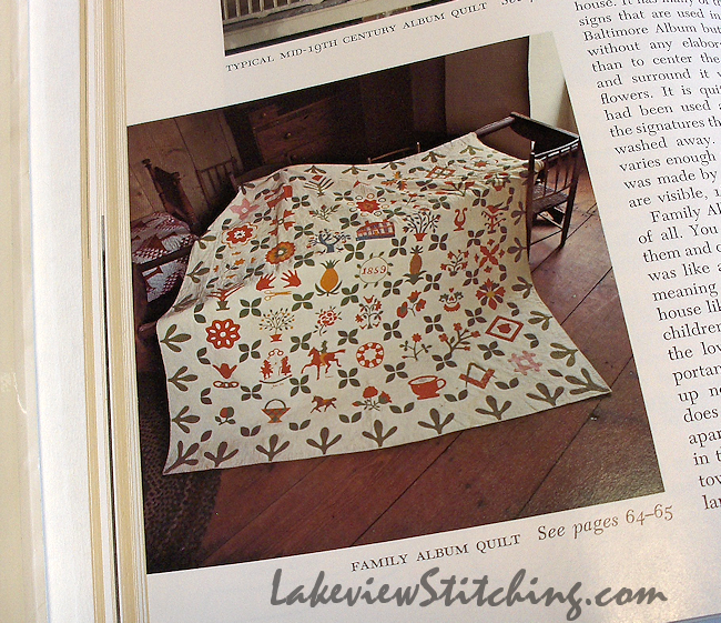
There are plenty of quilts with more detail as well, like this wonderful Family Album quilt:

Family Album Quilt, 1859

I've been looking for basic applique patterns recently, and this book is just right for my current skill level. The designs are simple but not juvenile:


And if the applique is not enough, there are many good pieced quilts as well. I love the setting for these Kansas Troubles blocks:


The blocks are here called "Indian Trails," which to me suggests a good colour scheme as well. I'd love to make it some day! The quilt is from Illinois in the early to mid 1800s, and the authors suggest that the threads have been saved and reused, as well as the fabrics!

Another quilt I'd like to make is this Sunburst quilt, which was started at the end of the 19th century by the mother of Pearl S. Buck:


Apparently the background is red! Pearl Buck's parents were missionaries to China, which may explain the inspiration for the colour. I love how it has elements of both a sunburst and a Dresden plate, as well as the large, graphic design. And plaids too! So, that's another one for my to-do list.

Finally, on the same page as the Pearl Buck quilt, there's another simpler sunburst quilt:


What do I like about this? The cat, of course! I think cats have been staking out quilts as long as there have been quilts and cats!

Thursday, October 16, 2014

DitG Fabrics and Plans

Over the past two weeks I've done quite a bit of prep work for my version of Leanne Beasley's Down in the Garden. It's finally all coming clear in my mind! Choosing the fabrics has been the final catalyst for me.

Flight Patterns' Bargello

When I started my other stitchery quilt, Best Friends Forever, I started by choosing thread colours that I liked. Since then, I've had a heck of a time finding fabrics in the same colour scheme. In the end, I will have to use almost entirely monochromatic blenders for that quilt. Which is fine, but I really prefer prints. Down in the Garden will be based on Tamara Kate's Flight Patterns collection. I've already fussy cut the Bargello print in the photo above for the Dresden blocks:


I will also use the Bargello fabric for the border. The thing I like the most about this collection is the light, watercoloured brushstrokes that were used by the designer. I want to keep that feeling with the rest of my fabrics. I pulled out some of my Riley Blake ginghams:


And I added some dots and simple prints:


Almost all the fabrics have some white areas, which keeps everything light and about the same saturation level. Since my last post on this project, I've been stressing about the herb pots that I've already stitched. Is the fabric I used for the pots too dark or too grey? Here they are in the mix:


I was worried that the herb pot patches would be dark holes against all the other light fabrics, but they are not too bad in this photo.

Now, though, there is another wrinkle, because I have changed the font in all the other blocks. I mentioned last time that I planned to change the words on the quilt to a couple of quotes that resonated better with me. I used Microsoft Word to do the layout for me, and just taped it over the original words where they occurred. Here's my revised layout for Block 5:


The font is Gabriola, 65 pt. I added a plus sign for the line breaks, which I plan to stitch as a little flower. I've found that a light box is not necessary with light fabrics. I just shine a bright light down from the top. Here it is all traced out:


That's 2.5 hours work! The block is 15" square. As I did with my redwork, I traced everything with pencil first, and then went over the lines with a 005 Pigma Micron permanent pen. I hate it when the lines rub off while you are stitching. And this time, I'm also planning to add some watercolour effects with Tsukineko inks before I stitch, so the lines have to be permanent.

Almost all the stitching will be stem stitch, because I don't want to spend as much time stitching as I have with Best Friends Forever. Plus, I've realized that the inking is still going to take several days.

Some of the smaller flowers, though, will be done with lazy daisies and granitos. For those flowers, I only marked dots where the needle will go through the fabric, rather than a whole loop that may not be covered by the stitch. You can see how that works on one of the birdhouse blocks:


All the tracing is now done. I'm still a long way from stitching any of these big blocks, but I have started on the smaller ones. I'm going to wait and see if I will need to re-stitch the herb pots, either onto lighter fabrics, or with the new font. I'm really happy with my stitching on those, so I'd hate to have to do them again. Stay tuned!

Monday, October 6, 2014

Making Cats

I can't seem to leave this new quilt, Jacks and Cats, alone! Today I was just going to cut out all the white smiles, when before I knew it I had all eight cat heads cut out as well:


Then I thought I may as well choose colours for the noses:


And, since I was that far, I should probably glue baste them together before I put them away:


Now I can sew the features down at my leisure, and backstitch the teeth.

The hand dyed felted wools are from Wooly Lady. The colours are beautifully saturated but still luminous. The fabric feels like blanketing, lighter than other felted wools I've tried, and a little fluffy after washing. The freezer paper patterns stayed on well, though. Overall, I am very pleased with them!

I also spent most of yesterday sorting and cutting fabrics for the wonky nine patches that go between the faces. It's been mind-boggling trying to keep it all balanced (but wonky!), and I don't think I'll know for sure how it's working until I start piecing.

I'm really enjoying the wide variety of fabrics and techniques on this project -- machine sewing, felt applique, and some hand applique still to come. It's keeping me motivated!

Friday, October 3, 2014

Making Eyes...

...at you?


Here's looking at you, kid?


The eyes have it?


Billy Eye-dol?


Yes, it's been silly fun so far on my new Halloween quilt, Jacks and Cats. I made all the eyes with black felt pupils, instead of the satin stitch embroidery suggested in the pattern. I didn't want any white to show through, and I think it was about the same amount of work either way.


I will say that "easy and fun" changed into mindnumbing and dull about halfway through, but in the end I was surprised when they were all done.

Now I can start on the faces, which is when the fun will really start!

Sunday, September 28, 2014

Sashiko Inspiration

Best Friends Forever Month 5.4

Back in July I was just starting Month 5 of Best Friends Forever, and looking for a new way to fill in the large circle in the centre of this motif, when my blogging friend Jillian took a class on Kantha embroidery. The criss crossing running stitch of that technique reminded me of some Japanese sashiko stitch designs:


I reviewed this book back in 2012. I decided to try out one of my favourite sashiko patterns for this motif. The grid was marked with a water erasable marker:


I stitched around the circle with stem stitch first.  This gave me an anchor for the lines of sashiko:


The stitches look loose here because I tried to blot out the blue ink before I took the photo. Not very well! But they are fine after a proper rinse. The back is cute too:


You can see how I was able to weave the ends into the stem stitch border.

This was the first part of Month 5 to be stitched, and then the motif languished while I stitched all the others. I really was low on ideas on how to colour and stitch the rest of it. In the end it is a little different - the first motif that doesn't have any yellow - and I am satisfied with it.

Plus, after my six week holiday from this project, I am refreshed and full of new ideas for Month 6! Three months left. :)

Related Posts Plugin for WordPress, Blogger...